Retention Editing: Six Cut Patterns and When Each One Backfires
"Cut faster" is the most repeated and least useful editing advice on YouTube. Cutting faster raises the rate at which new information arrives, which helps only if new information is what was missing. When the problem is that nothing is at stake, faster cuts just deliver nothing more frequently — and viewers leave anyway, slightly more agitated.
Method and evidence: The rubric and timings here are editorial suggestions for studying a video. They are not a measured retention dataset or a prediction of performance. Public competitor videos do not reveal private CTR or audience-retention reports.
What actually holds attention is a small set of patterns, each solving a different problem. This piece names six of them, explains the perceptual reason each works, gives the failure mode, and ends with a way to study the edit rhythm of any video closely enough to learn from it.
- Attention is held by unresolved questions, not by cut frequency.
- Every pattern here is a way of managing anticipation, not a way of adding energy.
- Your retention graph tells you where the problem is; only rewatching tells you what it is.
- Dips are usually caused by something thirty seconds earlier, not at the dip.
What retention editing is actually managing
An unresolved question can be one reason to keep watching; other reasons include learning a procedure, enjoying a performance or checking a fact. The patterns below are editing options, not a complete psychological model of attention.
This reframes the usual problem. When people say a video "drags," they rarely mean it is slow; plenty of slow videos hold audiences completely. They mean nothing is pending. A long, quiet shot of someone carefully cutting a joint is gripping if you are waiting to find out whether the piece fits. The same shot is unbearable if the fit was already shown two minutes ago.
So before reaching for any of the patterns below, check the structural question first: at this point in the video, what does the viewer want that they have not been given? If the answer is "nothing," no amount of editing will fix it, and the honest solution is to cut the section entirely.
The six patterns
1Compression cutting
What it is: Removing every part of an action that the viewer can infer. You show the first turn of the screw and the finished panel, not the ninety seconds between.
Why it works: Human perception fills gaps automatically. Showing a process in full does not increase understanding; it increases duration while understanding stays flat.
Where it backfires: When the process is the content. Compressing a technique demonstration to its endpoints removes the exact thing a viewer came to see. The test is whether the middle contains a decision. Repetitive labour compresses; decisions do not.
2The open loop
What it is: Naming something that will be resolved later, then deliberately not resolving it. "We'll come back to why that number is wrong."
Possible purpose: an unresolved question can give a viewer a reason to continue. State it clearly and deliver the answer. This article does not provide comparative data establishing that it is the strongest retention technique.
Where it backfires: When you open more loops than you close, or close them with less than you promised. Audiences track this more accurately than creators expect. Three open loops is about the practical ceiling; beyond that, viewers stop registering them.
3Pattern-and-break
What it is: Establishing a predictable rhythm — same framing, same beat, same transition — for long enough that the audience settles into it, then breaking it at a moment that matters.
Why it works: Attention is drawn to change, not to intensity. A break only registers if a pattern was established first, which means the "boring" repetitive section is doing necessary work. This is why relentlessly varied editing feels exhausting and flat at the same time: with no baseline, nothing is a break.
Where it backfires: If the pattern runs too long before breaking, viewers leave during the setup. Roughly three repetitions is enough to establish; five is pushing it.
4Visual-verbal offset
What it is: The image shows something slightly ahead of, or different from, what the narration is saying — cutting to the broken part while you are still explaining what should have happened.
Why it works: Two channels carrying different information keeps both engaged. When the image merely illustrates the words, the visual channel becomes redundant and attention drops to whatever else is on screen — which on YouTube means the sidebar.
Where it backfires: When the offset is large enough to cause confusion rather than interest. If viewers have to work out which channel to follow, they follow neither. Instructional content in particular needs tighter synchronisation than commentary does.
5The reset beat
What it is: A deliberate pause — a held shot, a silent moment, a slow establishing frame — placed immediately after a dense section.
Why it works: Sustained density is fatiguing, and fatigued viewers leave at the next natural gap. A controlled pause discharges the tension on your terms rather than the viewer's. Counterintuitively, adding a two-second silence often raises retention for the following minute.
Where it backfires: A reset beat placed anywhere other than after density reads as dead air. The pattern only works as a release, and a release requires prior tension.
6The forward cut
What it is: Ending a section one beat before it finishes and letting the next section start slightly early — no summary, no "so that's how you do that," no transition sentence.
Possible purpose: joining related sections may preserve continuity. Summaries can also help a learner consolidate an idea or navigate a long explanation. Choose the structure for the task rather than treating every natural stopping point as a failure.
Where it backfires: In genuinely complex instructional content, where the recap is doing real comprehension work. There, the fix is not to remove the summary but to attach the next open loop to it.
A redundancy check: compare the narration with what is visible. Repetition may be useful for demonstrating a step or supporting accessibility; it may be unnecessary in another scene. Identify the job of each channel before removing it.
Reading a retention graph properly
YouTube Studio's audience retention graph is often misread as a map of where problems are. It is closer to a map of where the consequences of problems became visible, and the two are usually thirty to sixty seconds apart.
Some patterns and what they typically indicate:
| What you see | What it usually means | Where to look |
|---|---|---|
| Steep drop in the first 30s | Packaging mismatch or a hook that did not confirm the promise. | The opening, and whether it matches the thumbnail. |
| Gentle continuous decline | Normal. Every video declines; the slope is what matters, not the fact of it. | Compare against your own channel's typical slope, not an absolute number. |
| Sharp localised cliff | Something specific and identifiable — an ad read, a tangent, a long setup. | Start watching about 45 seconds before the cliff. |
| A rise (a spike upward) | Rewatching. Viewers scrubbed back, which means something there was worth repeating or was unclear. | Study that segment closely — it is your most valuable ten seconds. |
| Flat then cliff at the end | Usually healthy — viewers leaving once the payoff has landed. | Check whether your outro is longer than it needs to be. |
The rise is the most under-used signal on the graph. A segment people rewatch is a segment that either delivered unusual value or failed to explain itself the first time. Both are worth knowing, and you can only tell which by watching it again yourself.
Studying an edit you admire
Editing rhythm is nearly impossible to analyse at full speed, because the whole point of good rhythm is that it does not draw attention to itself. The only reliable method is repetition: watching a short segment enough times that the effect wears off and the structure surfaces.
- Pick a segment, not a video. Sixty to ninety seconds from the middle — the part that is hardest to make watchable. Openings are studied to death; middles are where craft actually lives.
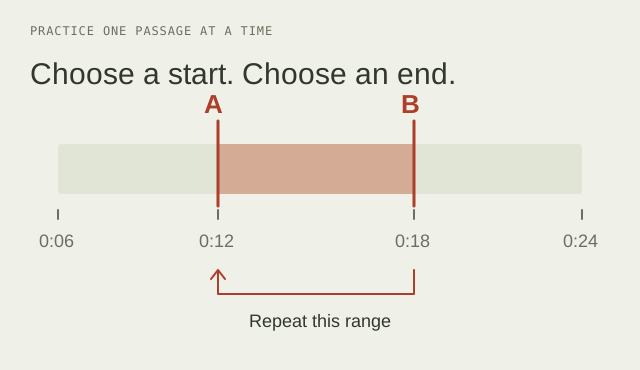
- Revisit the segment. Note its start and end times, then review it on the original video page. For footage you own, use your editor’s repeat controls to study the passage without exporting someone else’s media.
- Pass one: count cuts only. Ignore content entirely. Tally the cuts, and note roughly how long the longest and shortest shots are. You are establishing the baseline rhythm.
- Pass two: mark where the rhythm breaks. Note the timestamps where shot length changes noticeably. Then ask what was happening at those moments — breaks are almost never random.
- Pass three: audio only. Look away from the screen. Where does the music change, where is there silence, where does the voice speed up? Audio carries more of the pacing than most creators credit, and separating the channels is the only way to hear it.
- Pass four: list the open loops. Write down every unresolved item the segment creates and where each one closes. Keep the source URL and timestamps in your own notebook or the research worksheet.
Four passes over ninety seconds takes about twenty minutes and teaches more than watching ten videos at normal speed. The output should be written down — a set of notes on rhythm and loop structure that you can compare across creators.
Keep a record you can check
Review each passage on its original page and note the source, timestamp and observation.
Download the research worksheetWhat to change first
If you are editing your own work and want the highest-yield changes in order:
- Delete every section that has nothing outstanding in it. Not shorten — delete.
- Remove the summary sentence at the end of each section, unless comprehension requires it.
- Find the three longest stretches where picture and audio say the same thing, and change the picture.
- Add one open loop in the first forty seconds and make sure it closes.
- Only then think about cut frequency.
Frequently asked questions
Sources and scope
- YouTube: audience-retention reports — what the report can show for your own videos.
- YouTube: title and thumbnail tests — native testing and the meaning of its results.
The linked documentation supports platform definitions and features. The article’s practical framework is YTGrid’s editorial reasoning. For a record you can inspect, use the research worksheet and worked example.
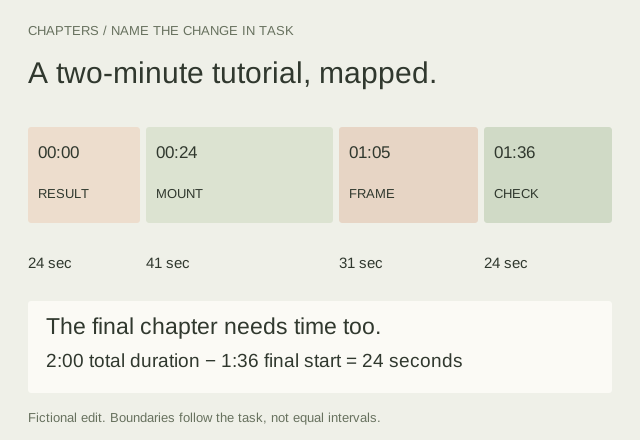
Plan Useful Chapters for a Finished Video
Map a two-minute edit, name the changes in task and check the final chapter as carefully as the first. Includes a blank chapter worksheet.
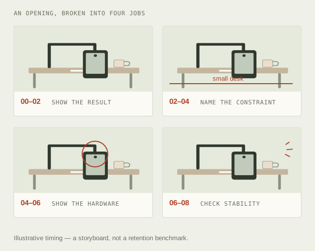
Build a Shot List Around What Each Image Needs to Do
Turn a viewer promise into a visual sequence. A fictional fourteen-second plan connects framing, audio, purpose and estimated runtime.
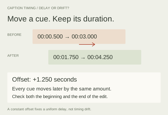
Fix Caption Timing Without Losing the Meaning
Read an SRT cue, distinguish a constant offset from drift, review overlaps and export a caption draft you can check against the final edit.